Posts Tagged ‘ modern kitchen design ’

Before & After: Coronado J Project

Hi friends! We are back at it again, and boy oh boy do we have a good post for you today.  You’ve probably seen us post our latest Coronado J Project on Instagram, and what a beauty she turned out to be! If you’ve been following us on social for a while now, you may have even seen us post a couple of snippets of this project during the construction phase, too. We have shared the during, the after, but we have yet to share the BEFORE. Yep, the time has come. We are showing you the before and after photos of our Coronado J Project right here, right now. It is mind-boggling, to say the least, so buckle up!


THE EXTERIOR

BEFORE
AFTER
AFTER

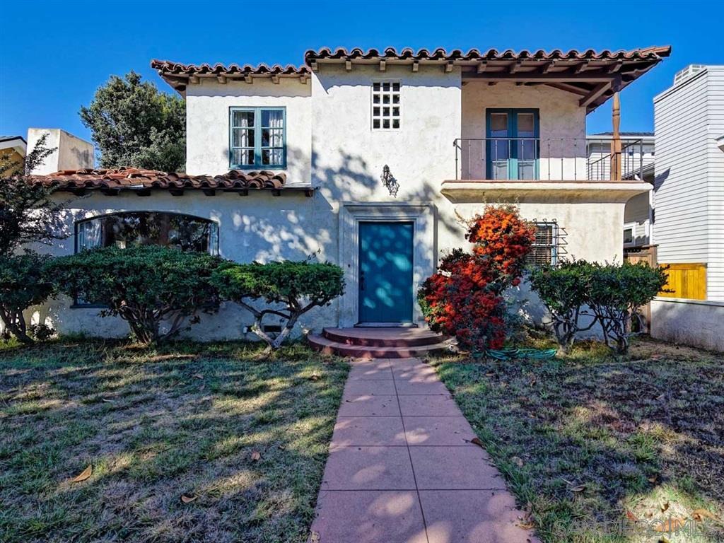
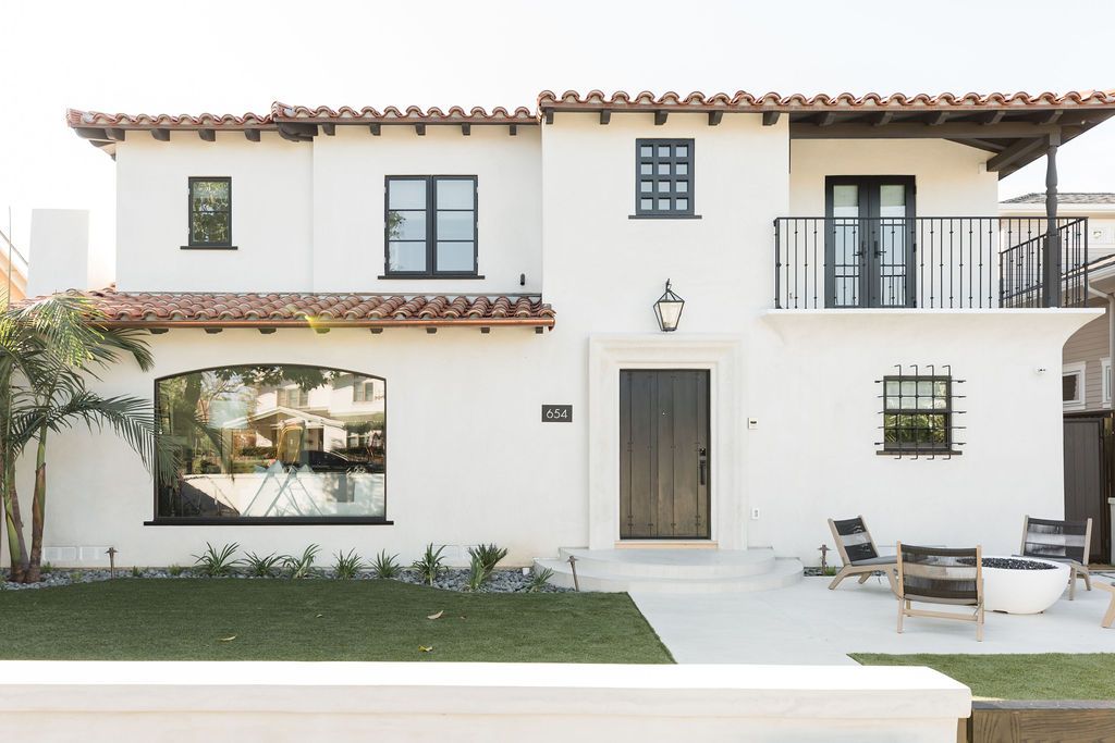
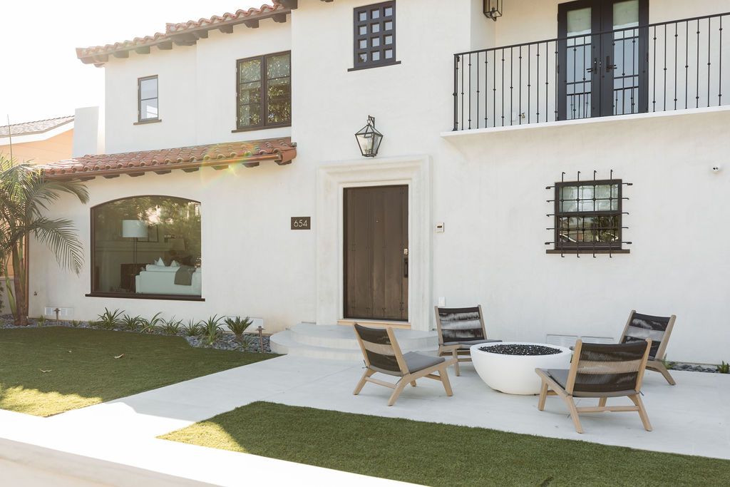
This home has Old Spanish roots, so we wanted to stay true to that essence, but give it a major facelift and a breath of fresh life. We said bye-bye to the blue door and windows and modernized the home with black pops of contrast, a new and improved Spanish-style railing, and a new lantern over the door. We can’t talk about all that is new to this home without pointing out the addition to the upstairs. We teamed up with Christian Rice Architects to bring this house to great lengths, literally and figuratively. Not only did the home itself get some improvement, but the landscaping did, too. New plants, pavement, and a cozy fire pit can go a long way!


THE ENTRYWAY

BEFORE
AFTER
AFTER
AFTER

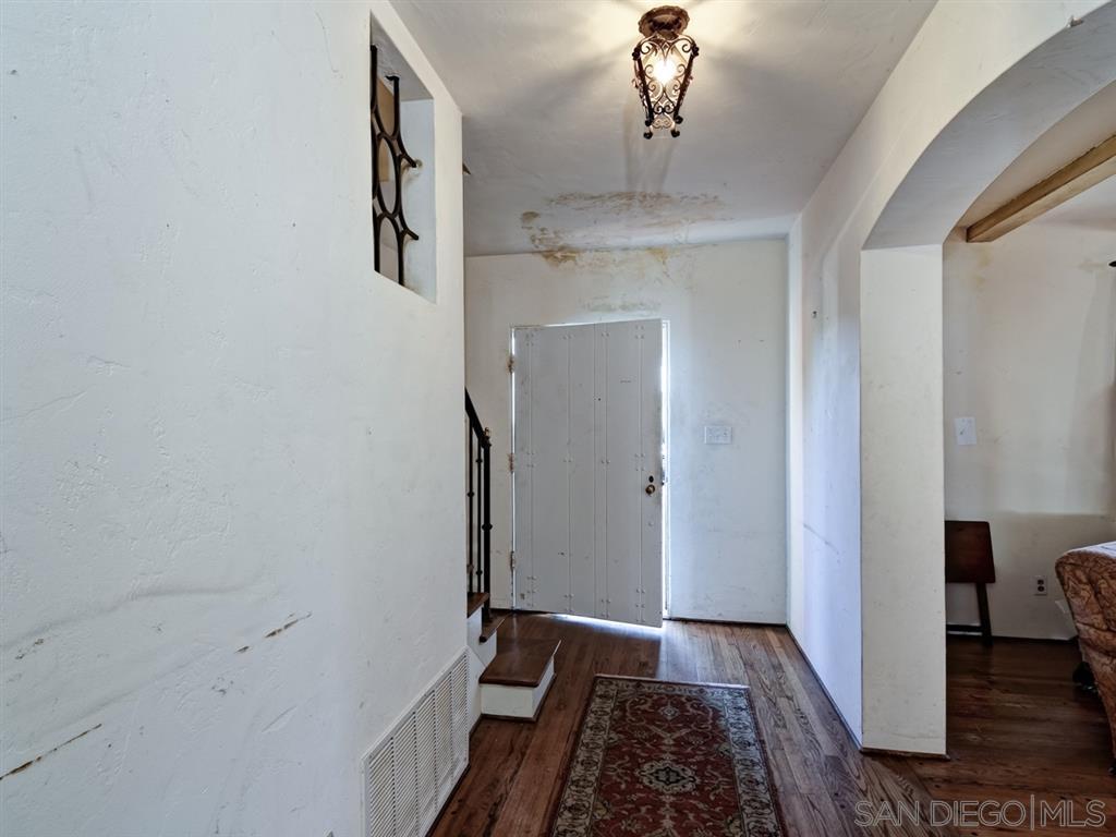
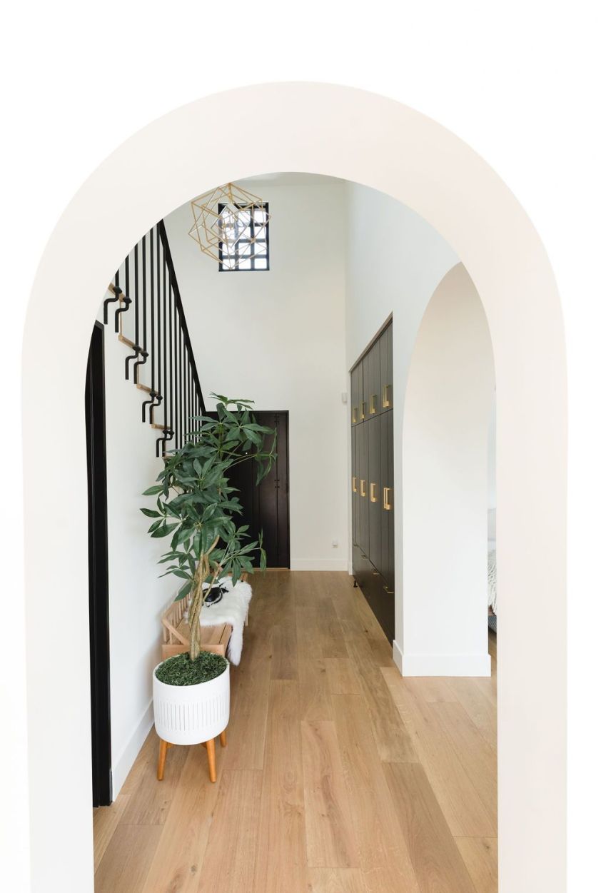
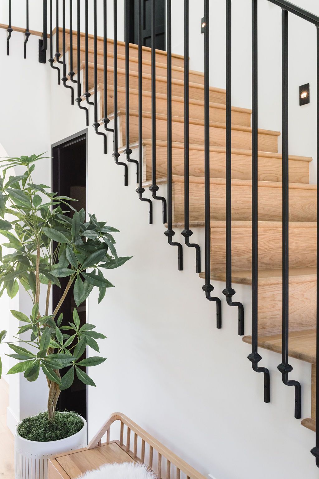
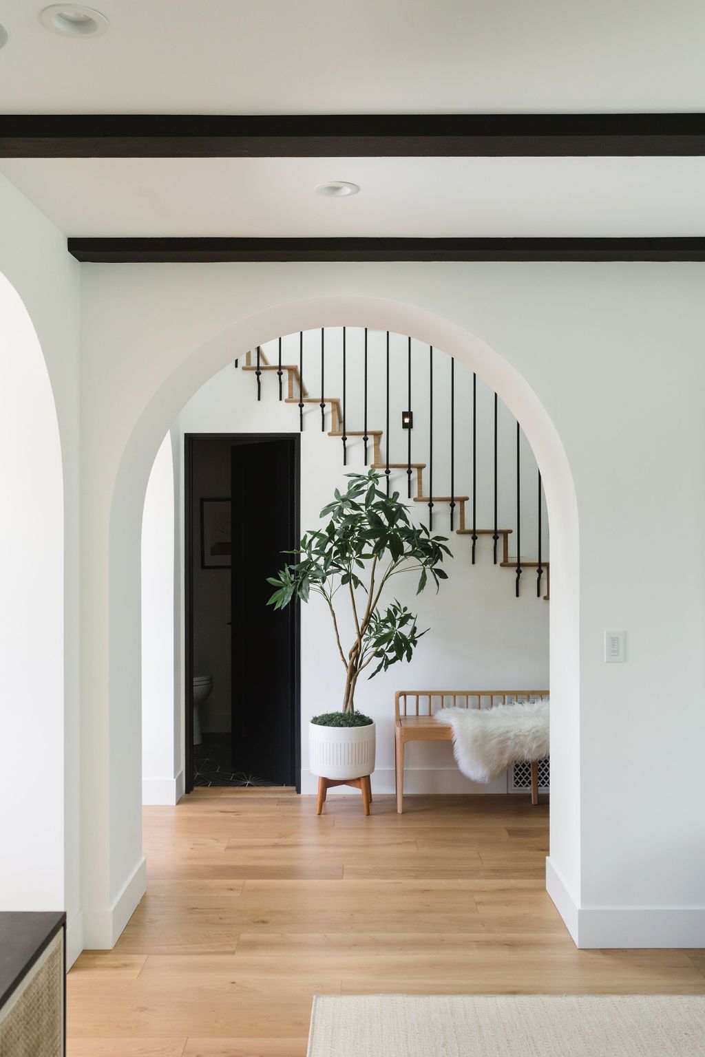
WOAH. Talk about a transformation! We made a few minor adjustments here. Just took down some walls, raised the ceilings, and some new hardwood flooring throughout – no big deal right? If only things were that easy! We added a powder bath underneath the staircase and added some built-in storage on the sidewall. We also gave the staircase a brand new railing which is probably one of our favorite features of the whole home.
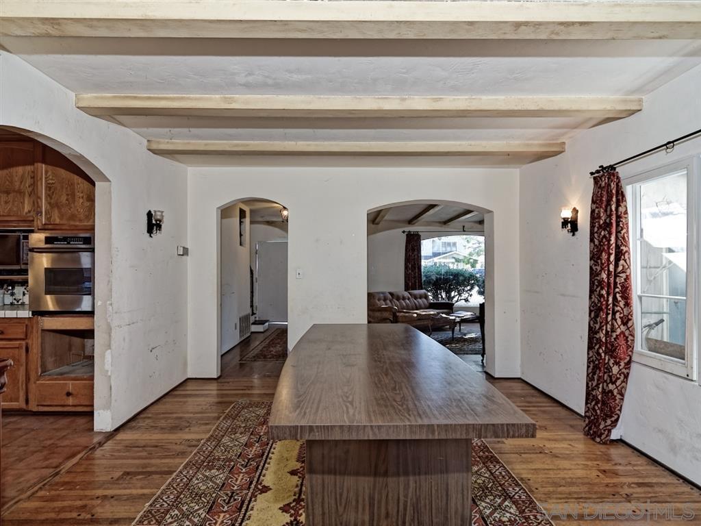
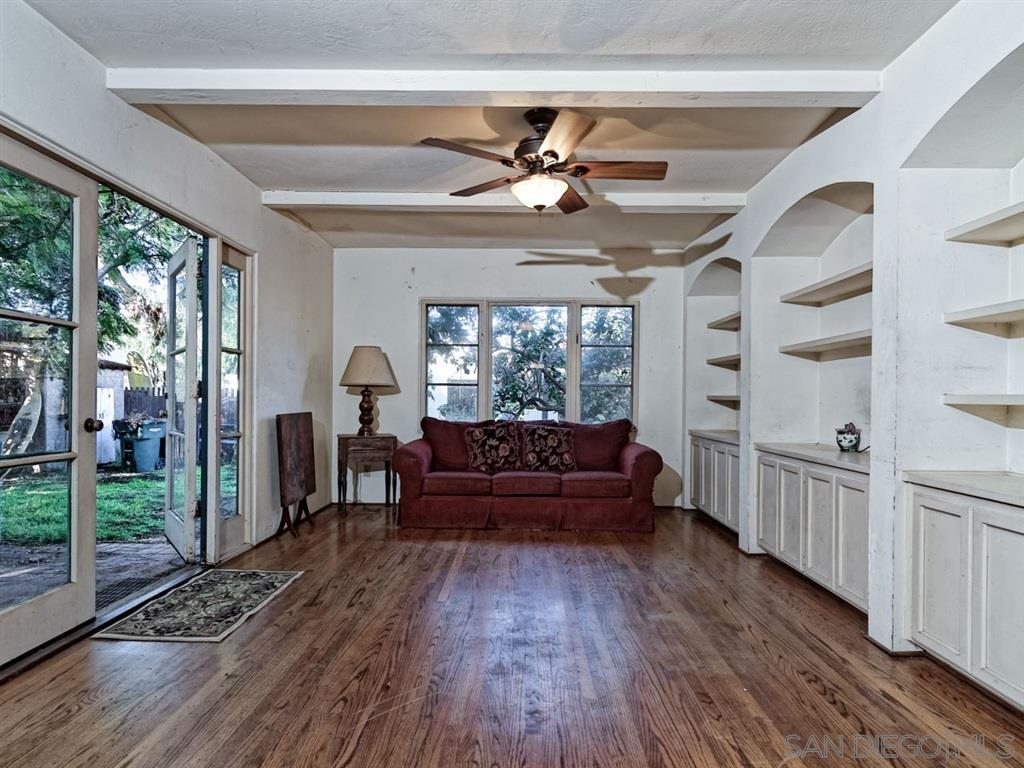
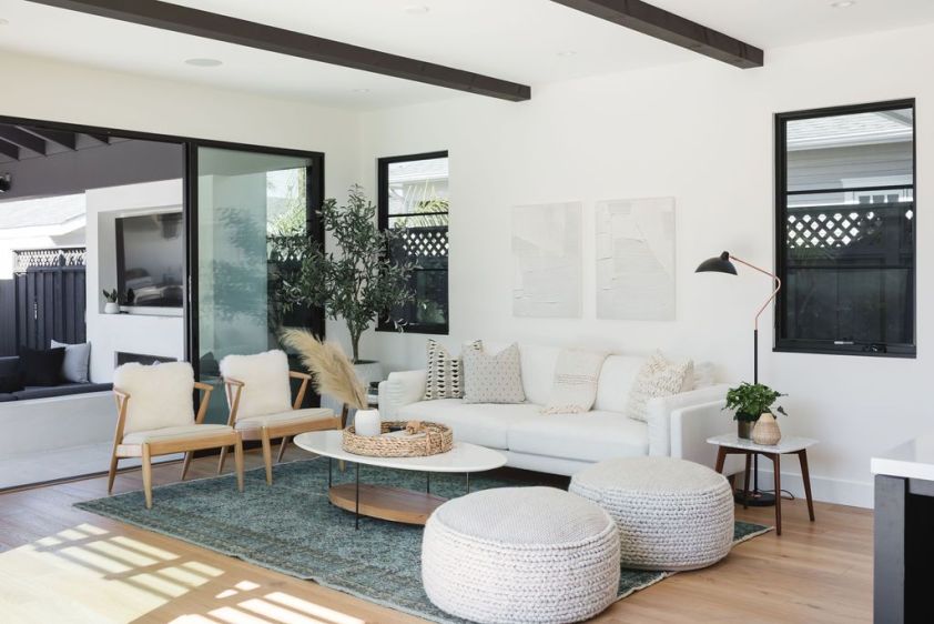
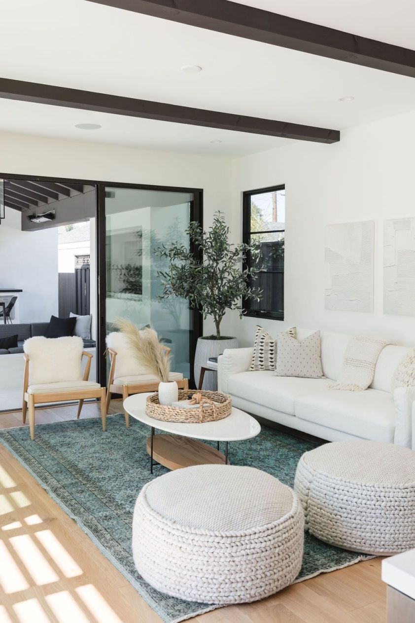

THE GREAT ROOM

BEFORE
BEFORE
AFTER
AFTER

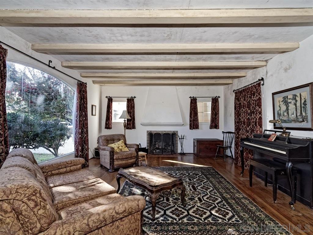
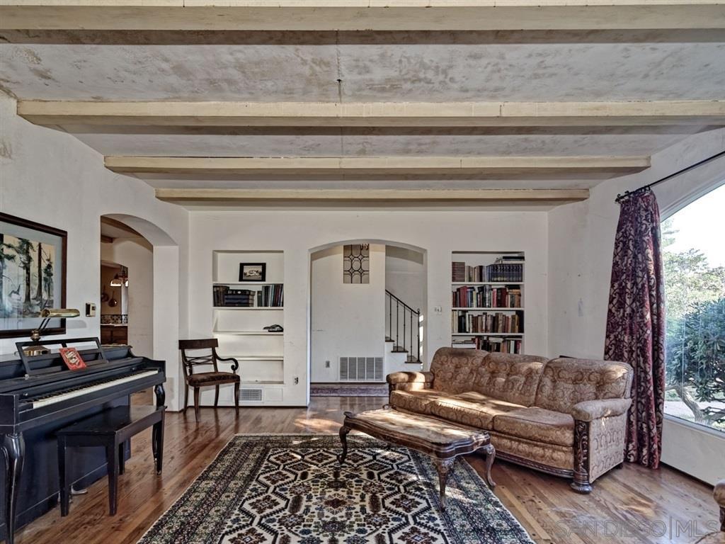
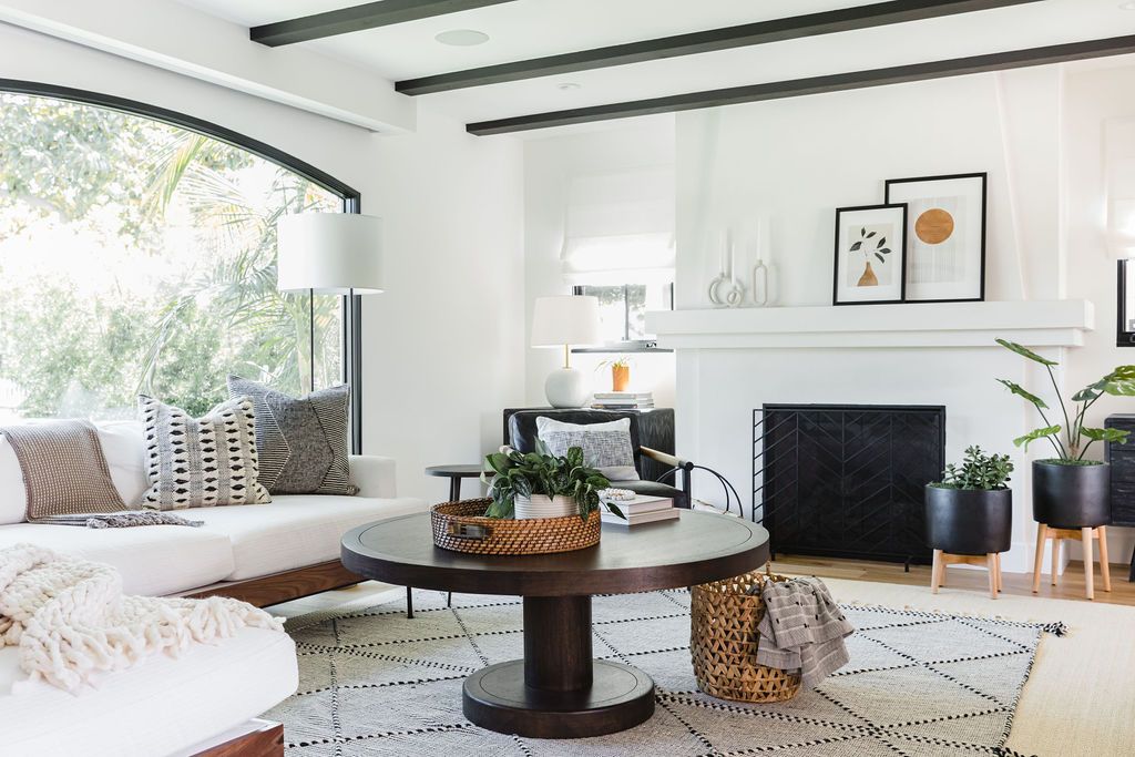
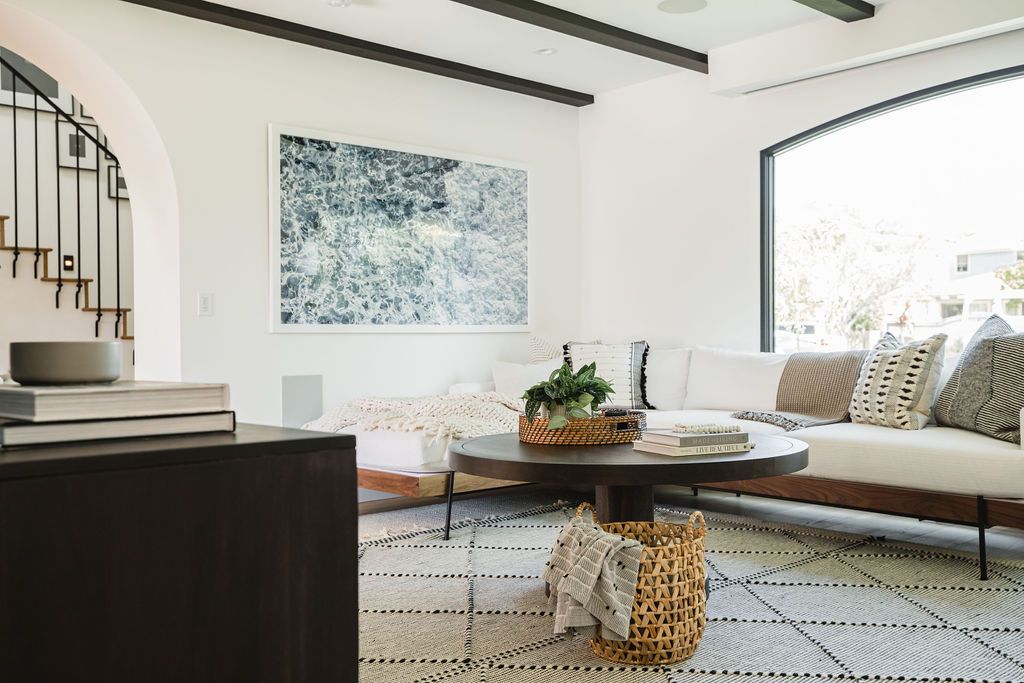
For starters, we ousted the outdated furniture. We wanted to keep elements of the Old Spanish character, so we kept the beams on the ceiling but gave them a brand new paint job in black to create a modern, stark contrast against the white interior. The classic combination of black and white can really hit the spot! We took out the alcove shelving to keep things more clean and simplistic, and we restructured the archways to be less boxy and more curved and timeless. The window frames and fireplace got some upgrades, and we kept that big window in the front to allow all the natural light inside. Lastly, we topped it off with some beautiful furnishings to suit this family’s coastal, laid-back lifestyle.


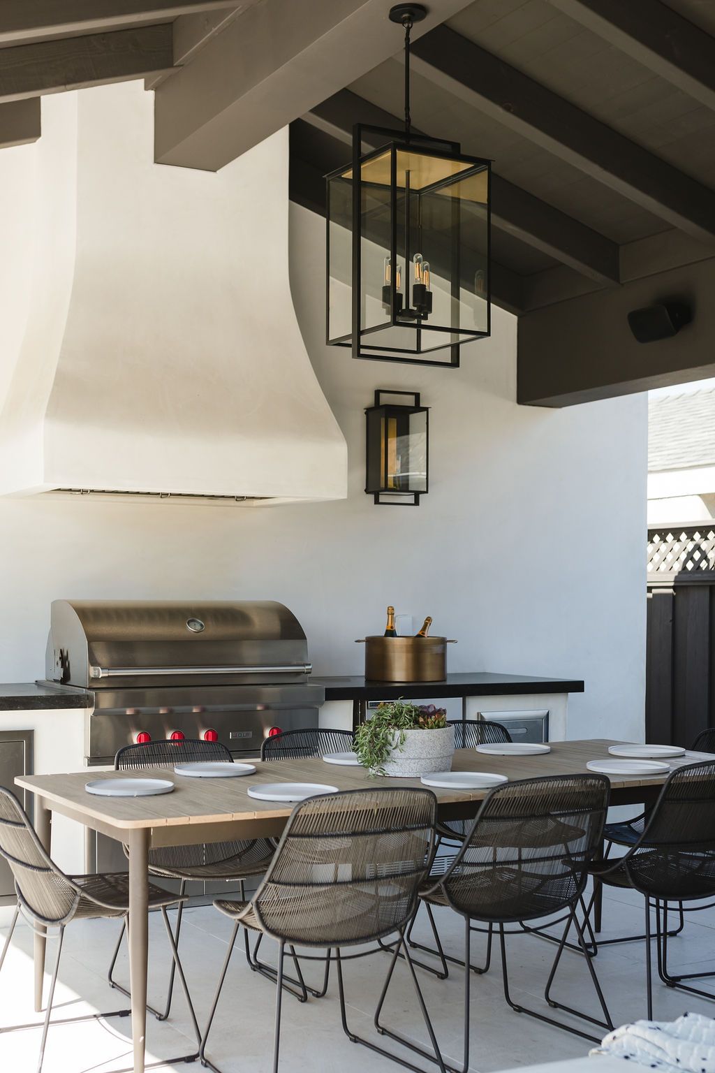
THE BAR & DINING ROOM

BEFORE
BEFORE
AFTER
AFTER
AFTER

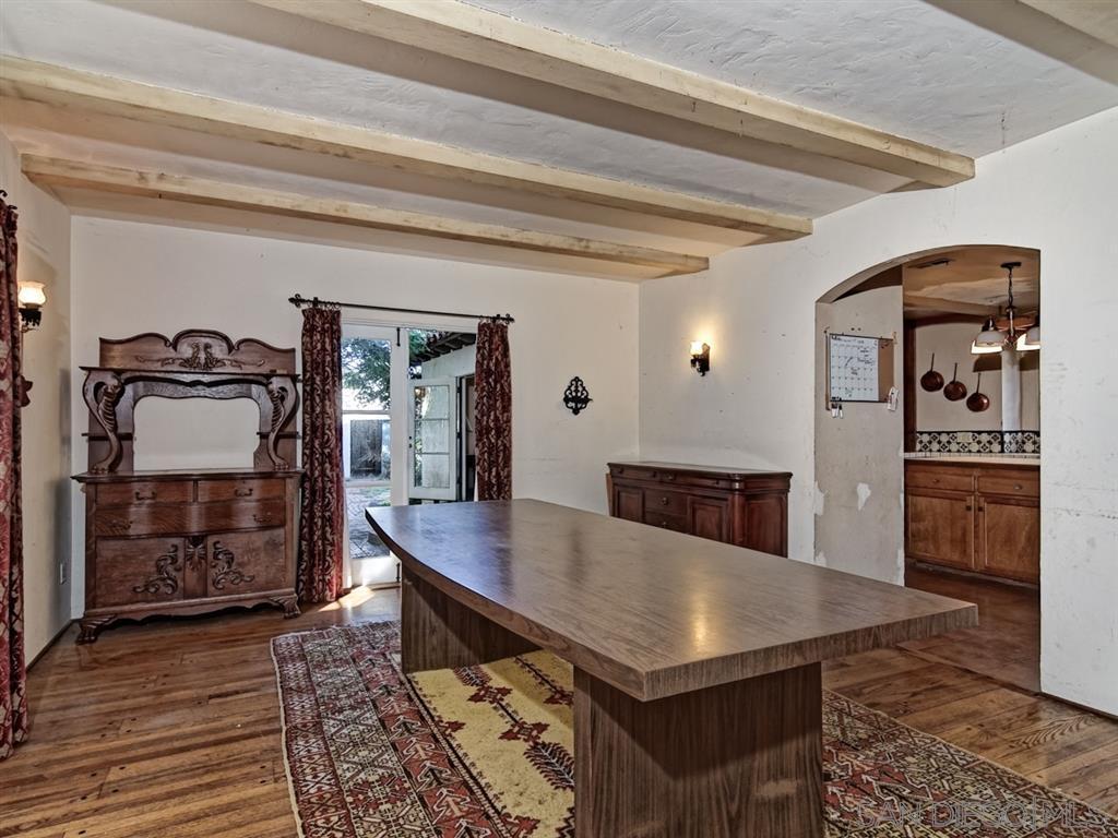
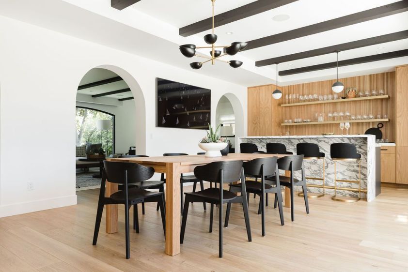
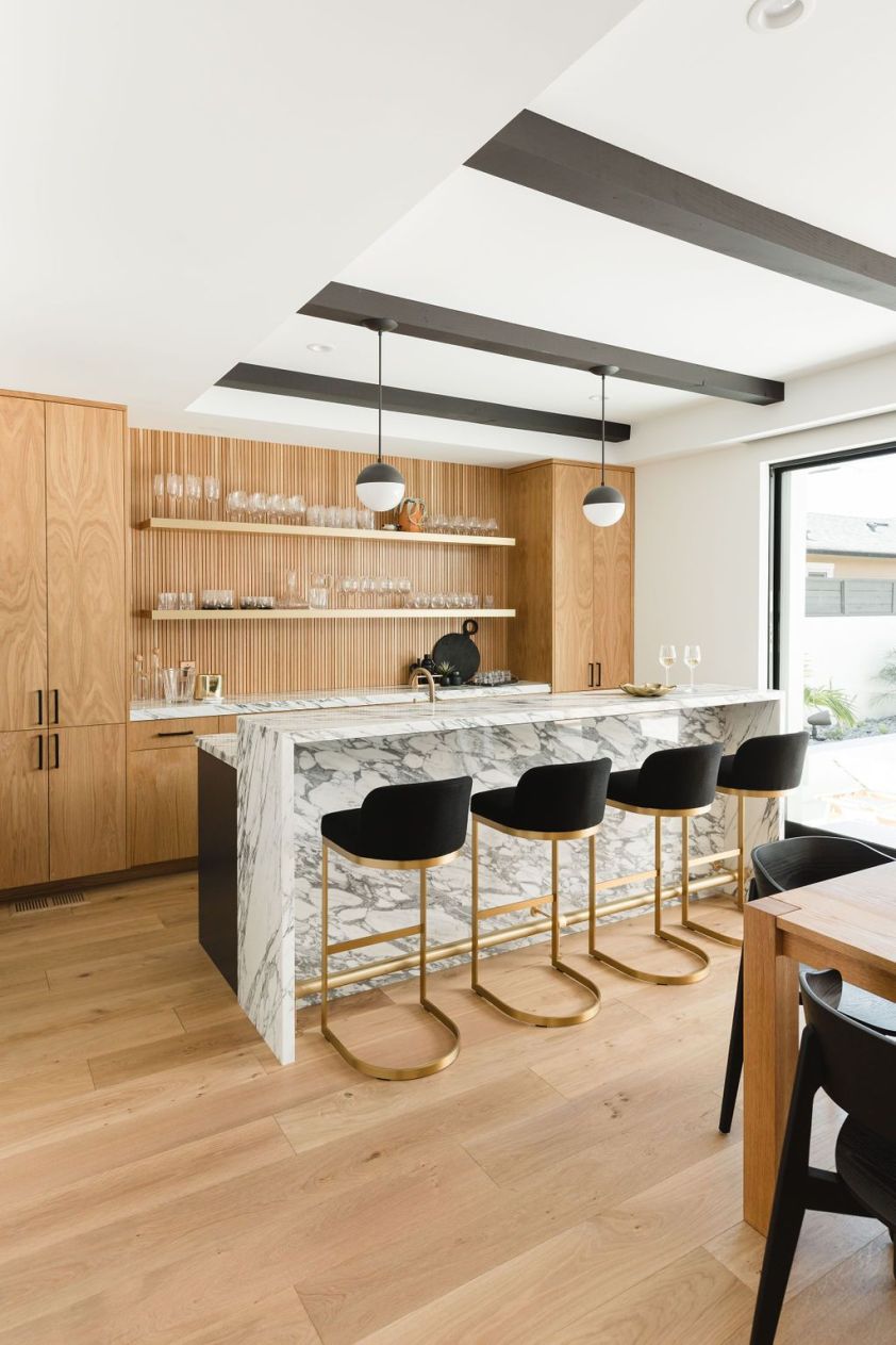
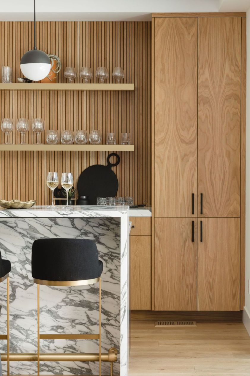
Drumroll, please… say hello to the new bar and dining room! This home bar has got to be one of our favorite design moments to date. Thanks to Mill Brothers Fine Woodworking Inc., we were able to bring our white oak vertical wall paneling dreams to life. It’s modern and minimal but with a punch of warmth and contrast. This millwork and shelving is a total showstopper in itself, but we aimed to keep materials rich and natural for an elevated and refined feel. A sleek marble bar with a waterfall edge paired with a brass foot rail and modern pendants really knows how to make a girl swoon! Fun fact about this bar space, our architect dream team, Christian Rice Architects, added some square footage to the home to make this space possible. If you look at the before photos, you will notice that this room was expanded to add in an extra archway from the great room into this bar and dining room and the beams on the ceilings were flipped to run parallel to the adjacent great room. Fun, fun!

AFTER

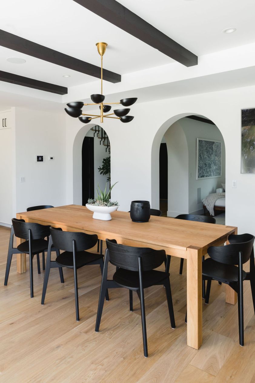
We leaned into a sleek and modern look for the dining area of this space. A light and bright base with some moody warmth and contrast for the win! As for that shared wall leading into the kitchen seen in the before photos, we busted that bad boy down to open things up into one big, functional floor plan.


THE KITCHEN

BEFORE
BEFORE
AFTER
AFTER
AFTER
AFTER

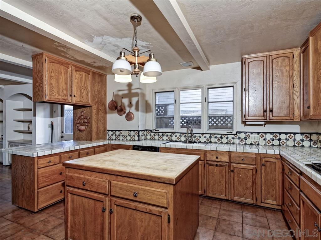
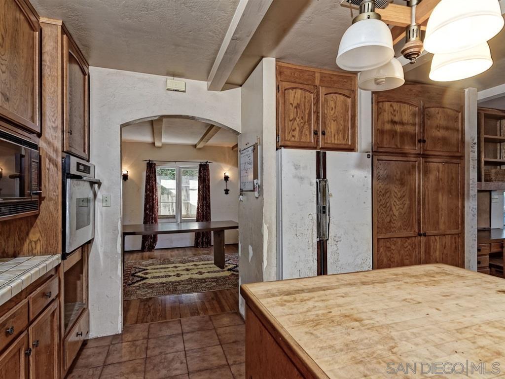
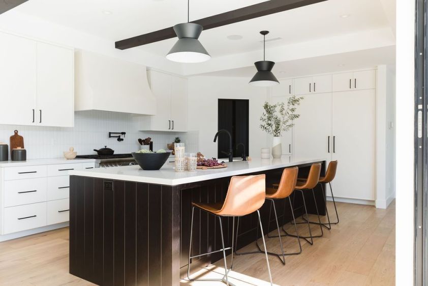
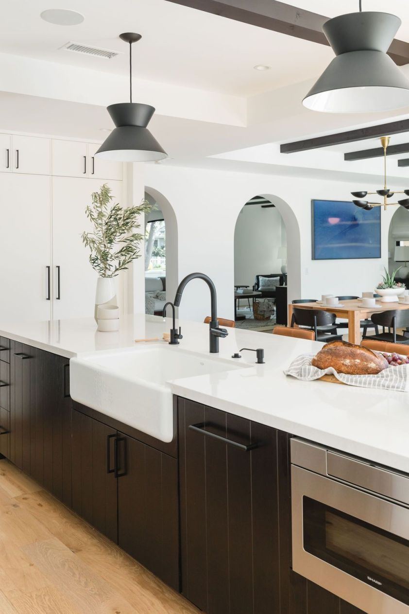
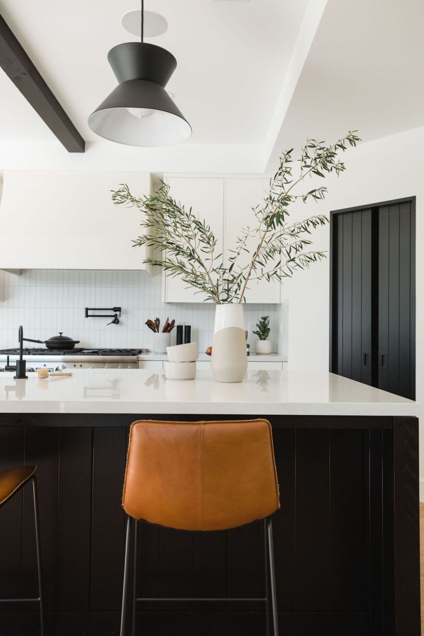
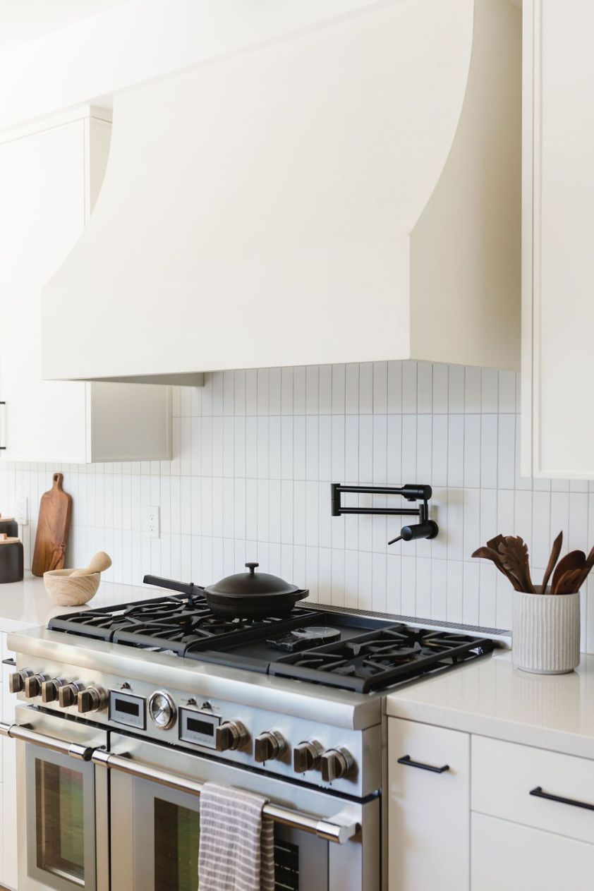
Oof! Those before photos are rough on the eyes. The kitchen is one of the biggest transformations in the home and was entirely gutted. We knocked down the shared wall that housed the refrigerator, moved the fridge to the sidewall, and added a corner pantry. We moved the gas range, added a Portola hood for a plaster effect, and kept things clean and tidy with the vertical stacked backsplash in 2×8’s by Fireclay. Take a look at that kitchen island. Isn’t it a beauty? Did someone say black-stained oak? Yes, please!


THE FAMILY ROOM

BEFORE
AFTER
AFTER

If we were to sum up this room into one word, it would be windows! We said goodbye to the dated built-ins and shelving and said hello to LaCantina doors and pretty windows. This family room serves as a sort of landing zone between the outdoor area and the kitchen. Our main goal here was to keep things feeling casual, ethereal, and airy.


THE BACKYARD

BEFORE
BEFORE
AFTER
AFTER
AFTER
AFTER
AFTER

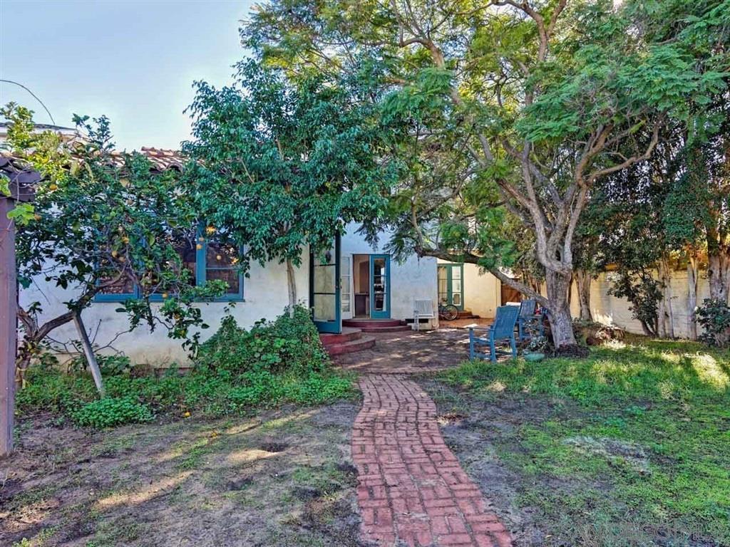
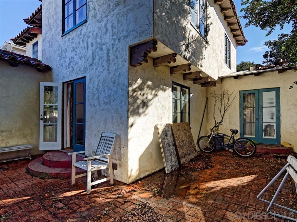
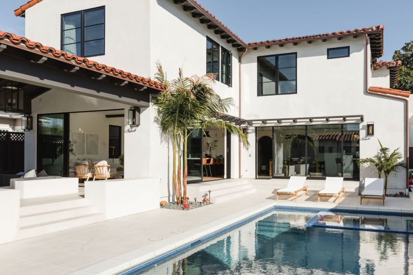
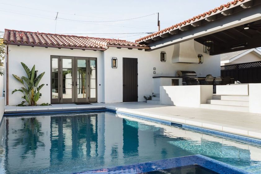
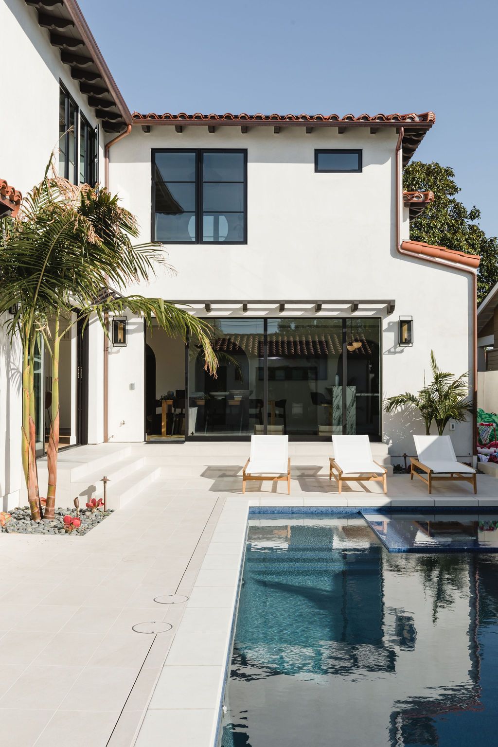
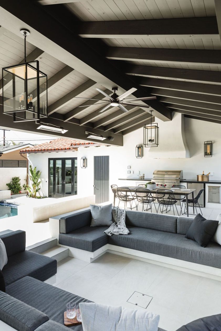
This is what backyard dreams are made of! To entirely harness all that is good about San Diego weather, the whole back of the home was structured to have an indoor/outdoor flow. The unkempt grass and brick are gone, and in their place are a brand spanking new pool, casita, outdoor dining space, and custom sunken sofa and TV zone. Yeah, when we said this is what backyard dreams are made of, we weren’t joking!

A historic Spanish modern home for one beautiful family is now in the books! Did we mention this is only the downstairs? It’s the house that keeps on giving, but we are leaving it at that for today. If you want to see the full project, check out Coronado J on our projects page. See you next time!

An Ode to the Color Blue

Kitchen from our Avenida Manana Project.

Hello, world! We are four months deep into 2020, and boy oh boy what a strange four months it has been. The time spent indoors has us all self-reflecting and perhaps even considering some long contemplated shifts within our everyday choices and lifestyles. Hopefully, these shifts are for the better. We hope no one cut their own bangs out there while in lockdown!

While some things may feel out of our control at the moment, one thing that we can have a bit of control over is the feeling and the mood that we have within our home. Our home should feel like a secure safe haven away from life’s curveballs. Turbulent times like these accentuate the importance of having a home that calms the nerves and makes us feel at peace. One easy way of setting the tone within the home is through the use of color. Designers have long been using color to evoke certain moods and emotions. Color isn’t something that you just see, but it is something that you feel. It creates an entire atmosphere.

It should be of no surprise that we here at South Harlow love using the color blue in our projects. We’ve used this color in forms of paint, tile, furniture, and small accent décor pieces. Being based along the San Diego coastline makes our love of blue come ever so natural, however, there are some major psychological benefits with this oceanic hue that we also try to incorporate within the home.

Kitchen island in Sherwin Williams Foggy Gray paired with cabinetry painted in Sherwin Williams Crushed Ice from our Avenida Manana Project.

Blue is widely known to be beneficial to the body and the mind due to its calming and soothing effects. In fact, the color blue has been linked to lowering blood pressure and slowing down the heart rate. Blue has been known to represent serenity, peace, loyalty, and inner security. Lighter blues can instill a state of tranquility, help clarify the mind and thoughts, relieve stress, and can even improve concentration. Blue reflects nature: the sky, water, and air. It can be quite grounding; therefore, it is a favorite to incorporate within the home as an effort to bring a sense of connection with the outdoors.

Some of our favorite places to use blue is in the heart of the home, the kitchen. We love using it as an accent color for a pop of cool tones while mixing it with the warmth and textures of wood, woven elements, brass, and leathers. Bathrooms are another favorite space for us to use the color blue. It can create a spa-like atmosphere and can enhance relaxation while providing a fresh feeling.

Blue Danube field tile from European Tile Art in our Hymettus Project.
Kids bath from one of our most recent projects. Playful blue paired with the contrasting warmth of brass hardware and faucets.

It’s important to note that too much blue can feel cold and can almost have the opposite desired effect, so we love pairing it with neutrals like white, warm grays, and beige. Some of our favorite neutral paint pairings are Benjamin Moore’s Edgecomb Gray, Sherwin Williams’ Snowbound, Sherwin Williams’ Ceiling Bright White, and Sherwin Willilams’ Crushed Ice.

If you are looking for something a little more temporary and interchangeable, adding some pops of blue through home accessories and décor pieces are always an easy option. A patterned throw pillow, vase, or basket is a great way to make your house feel well-lived in and can also add some necessary layers and textures.

Pops of blue used through accent art in our Skylark Project.
One of our favorite calming color palettes seen here in our Skylark Project: light blue, white, and warm gray.
A relaxing scene from our Chelsea Project.

Our ode to blue is a forever love affair, and learning how to use it for all its psychological benefits can help you level up your interior game. If this pandemic has taught us all anything, it is the importance of having a calm mentality throughout all of the uncertainty. As the funky moods ebb and flow, one stable ground that can keep our nerves at bay is the look and feel of the home.

If you’re in the shopping mood and want to add a little blue to your life, we’ve rounded up a few of our favorite home accessories from South Harlow Home below. As for now, that’s it for us. Stay well friends!

Shop blue: 1. Diamond Patterned Stoneware Planter in Large , 2. Denim Blue Square Pillow , 3. Large Sea Glass Beads in Dark Blue , 4. Hand-Woven Abaca Basket in Blue

Point Loma Project Reveal

We have been busy over here at South Harlow with lots of exciting things in the works! One of those being our very own blog. We’re so excited to share design details, tricks of the trade, and our love of all things interiors with you all.

If you’ve been following us on the South Harlow and South Harlow Home Instagram pages, you may have noticed a very sleek and modern new project of ours that has recently come into completion. We are here today to do an official project reveal of our Point Loma remodel, and we are spilling all the beans! We teamed up again with talented photographer, Samantha Goh, to snap some beautiful images of the kitchen, family room, and powder bath. So kick back, relax, and enjoy the tour.


T H E   K I T C H E N

This project was a fun one! We got to flex our modern muscles, experiment with more color contrast, but still stayed true to our core design aesthetic. We really went for timeless, clean lines mixed with bold accent color for this kitchen. We worked with our contractor dream team over at Classical Kitchens for all of the cabinetry. So excited our client was keen for some flat-panel cabinet fronts giving this kitchen a clean and sleek feel.

To keep things neutral and soft, we chose oak flooring because you can never go wrong with light, hardwood flooring, am I right? The counters are quartz, a marble look-a-like, while cabinetry is painted in Benjamin Moore‘s “Cheating Heart” for some stark contrast. We pulled it together by adding warmth through the use of satin brass hardware from Schoolhouse and adding walnut finishes on the hood and open shelf. We stuck with a stainless steel range with brass collared knobs from JennAir.

One of our favorite design features in this kitchen has got to be the quartz kitchen island with a waterfall edge detail. It keeps the kitchen feeling fluid and open. We chose walnut barstools to tie into the walnut detailing spotted in other parts of the home. Matte white and brass pendants from Rejuvenation hang over the kitchen island providing for some fun accent lighting, while windows with custom Roman shades are nearby for daytime natural light.

We chose a stainless steel refrigerator from Sub-Zero to match the range. To keep things sophisticated and clean, we went with Brizo‘s matte black and luxe gold pull-down faucet with arc spout. The pull-out spray wand in gold plays into our brass pops seen throughout the whole kitchen. We had to hone it all in and give this kitchen some life by styling in a few of our favorite South Harlow Home kitchen accessories.

Shop the look: 1. Ceramic Canisters , 2. Metal Storage Boxes , 3. Woven African Basket , 4. Speckled Stoneware Jar in Small


T H E   F A M I L Y   R O O M

The home has an open concept so that the kitchen and family room flow together into one communal space. The oak flooring and black cabinetry continue throughout the living space keeping the home cohesive. It was important for us to give this family room a subtle show stopper moment, so we gave the fireplace a little facelift with Moroccan zellige tiles in “Desert White” from Exquisite Surfaces.

Of course, we needed to maintain the color palette into the family room, so we added a custom built-in with quartz counters, media storage down below, and two additional walnut floating shelves. For the cozy family room feels to be in full-affect, we added in some plant life and South Harlow Home decor pieces.

Shop the look: 1. Polka Dot Throw , 2. Paulownia Wood Vase , 3. Glazed Stoneware Planter , 4. Striped Ottoman Cube


T H E   P O W D E R   B A T H

The powder bath was kept simple yet elegant. For the wall, we used 3″ x 12″ matte black subway tiles with contrasting grout to create a moody statement and bring attention to the herringbone pattern. The herringbone pattern creates movement and gives the feeling of vertically lengthening the wall in an overall small space. The vanity is a custom slab showcasing some caramel earth-toned perfection. A modern globe pendant from Shades of Light hangs overhead.

Delta Faucet for the win in here! We used their Trinsic wall mount faucet paired with the Trinsic towel ring, both in “Champagne Bronze”. Custom-built cabinetry lines the side wall for ample storage, and we spruced them up again with Schoolhouse hardware in natural brass. Lastly, we styled in some coastal-inspired artwork (we are in San Diego after all) coupled with a South Harlow Home vintage woven jug that our client snatched up and purchased immediately on site.

And just like that, our first ever blog post! We are so excited to share more projects, ideas, and designer insight here on the blog with you. We will be back in a few weeks with more excitement and content. Until then, thank you for reading and hope to see you soon!